
WordPressのCocoonテーマでの「目次」をカスタマイズしてみました。
少し前までは拾い物のCSSを貼り付けていただけなのですが、少し色を変えたいなと思いちょっぴりカスタマイズしています。
綺麗なデザインの方が読みやすいですよね
設定の仕方とともにCSSも貼り付けておくので、気に入られたらそのままご使用ください。
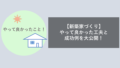
できあがりのイメージ
まずはできあがりのデザインイメージです。
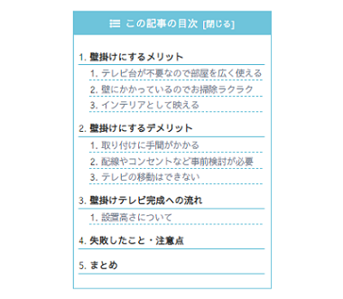
やさしい色の目次にしてみました。
北欧系の色が淡く優しいので好きです。
CSSをスタイルシートへ貼付けよう
CSSはどこに貼り付ければいいの?
ここから、CSSをどこに貼り付ければよいかを説明します。
「外観」→「テーマの編集」クリックします。
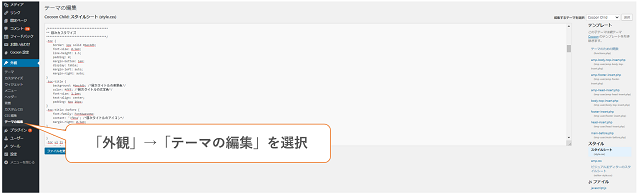
右端の項目から「スタイルシート」を選択します。
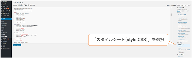
下図の欄にCSSを貼り付ければOKです。
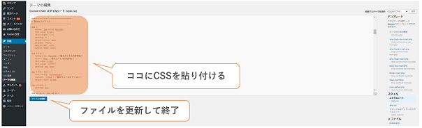
貼付け後は忘れずに「ファイルの更新」を押してください。
失敗しても元に戻せるように、バックアップを取りながら作業してくださいね!
CSS(コピーしてご使用ください)
CSSを「スタイルシート」内に貼り付けて更新すれば目次のデザインが変更されます。
以下のCSSをコピーして貼り付けてみてください
1 2 3 4 5 6 7 8 9 10 11 12 13 14 15 16 17 18 19 20 21 22 23 24 25 26 27 28 29 30 31 32 33 34 35 36 37 38 39 40 41 42 43 44 45 46 47 48 49 50 51 52 53 54 55 56 57 58 59 60 61 62 63 64 65 66 67 68 69 70 71 72 73 74 75 76 77 78 79 80 | /************************************ ** 目次デザイン ************************************/ .toc { border: 1px solid #6ec4db; font-size: 0.9em; line-height: 1.5; padding: 0; margin-bottom: 1em; display: table; margin-left: auto; margin-right: auto; } .toc-title { background: #6ec4db; /*目次タイトルの背景色*/ color: #fff; /*目次タイトルの文字色*/ font-size: 1.1em; text-align: center; padding: 6px 16px; } .toc-title::before { font-family: FontAwesome; content: '\f0ca'; /*目次タイトルのアイコン*/ margin-right: 0.5em; } .toc-content { padding: 8px; } .toc ul li a, .toc ol li a { display: block; border-bottom: 1px dashed #6ec4db; /*h3以下の下側ボーダー*/ margin-left: -20px; padding-left: 20px; } .toc ul.toc-list>li, .toc ol.toc-list>li { margin-top: 1em; } .toc ul.toc-list>li>a, .toc ol.toc-list>li>a { border-bottom: 2px solid #6ec4db; /*h2の下側ボーダー*/ font-weight: bold; } .toc-list > li li a { font-weight: normal; font-size: 95%; color: #708090; margin-left: -20px; } #header-container #navi a { font-size: 0.8em; } nav#navi, .menu-header .sub-menu { font-weight: bold; box-shadow: 0 5px 15px -5px rgba(0,0,0,0.2); } .menu-header .item-label { color: #b5b5b5 !important; } .menu-header .current-menu-item, .menu-header .current-post-item, .menu-header .current-menu-ancestor, .menu-header .current-post-ancestor, .menu-header .menu-item:hover { color: #333 !important; border-bottom: 3px solid #FDD835; transition: all .2s ease; } .menu-header .sub-menu .menu-item, .menu-header .sub-menu .menu-item:hover{ border-bottom: none; } .menu-header .current-menu-item>a .item-label, .menu-header .current-post-item>a .item-label, .menu-header .current-menu-ancestor>a .item-label, .menu-header .current-post-ancestor>a .item-label, .menu-header .item-label:hover{ color: #333 !important; transition: all .2s ease; } |
まとめ
デザイン性の高いブログの方が、ノイズが無く内容を理解しやすいですよね。
文字の大きさや色などは、CSS内の数値をいじれば変更できます。
まだまだ私も勉強中ですが、参考にしていただけると幸いです。

コメント